Type Design, Lettering & Calligraphy.
Not everything you do regarding typography can be classified in the same category. The process of creating letters comes in a wide array of forms, and each classification involves many different tools, skills and even different methodologies.
The word typography comes from the greek word Typos, which means form, and grapho, which means write. So basically typography is the art or practice of creating characters, or type. Having said that, it can be pretty clear that a typographer is someone who designs type. Easy, huh? But what about other categories like lettering or calligraphy?
Let's start with the definitions:
Calligraphy is "the art of producing decorative handwriting or lettering with a pen or brush" and Lettering is "...the creation of hand-drawn letters to apply to an object or surface".
What sets this two art forms apart from type design is that calligraphy and lettering both work with specific set of letters or words, they create custom pieces, whereas typographers create systems (fonts) that people use to write with, so it is VERY important that these systems end up working on any possible combination.
Lettering & Calligraphy have their differences too.
The most obvious one is that calligraphers use a tool to create their work, they often use pens with a nib, or brushes. Calligraphy requires a lot of practice and muscle memory, because you need to complement the movement of your brush with pressure to create thicker or thiner strokes.
Lettering on the other hand is a much more free discipline. It still has to follow the structure of the letterforms, but since lettering is based on drawing letters instead of actually writing them with a tool, they don't have as many boundaries.
Personally, lettering is one of my favorite categories of typographical work. I like that it is not such an strict discipline and that it allows you to go as crazy as you want. I often think of it as a puzzle where you need to assemble a bunch of letters together, and you can add as many pieces as you want: swashes, ligatures, flourishes, etc.
“Since lettering is based on drawing letters instead of actually writing them with a tool, they don’t have as many boundaries.”
Some of my favorite lettering artists include Martina Flor, Cyla Costa, Jessica Hische, It's a Living, Drew Melton... I could go on forever dropping names of amazing artists. Take a look at some of their work (man, it sure looks like they had a lot of fun doing these!). Notice how they work on a bunch of different styles and mediums?
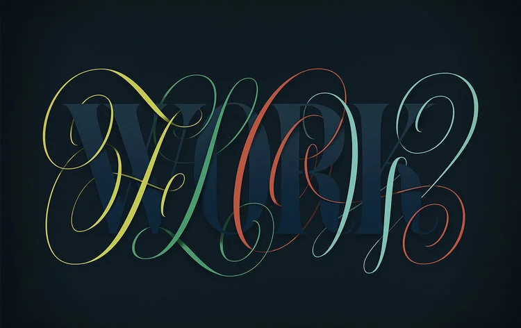
Image via http://www.martinaflor.com/portfolio/we-transfer/

Image via http://itsaliving.nyc

Image via https://www.behance.net/gallery/28360169/Bohemian-Rhapsody-for-MALC
Type design on the other hand is a completely different approach, and honestly I have so much respect for people that do this. This paragraph by Jessica Hische on her book "In Progress" really sums it up:
“...Type designers draw letters, but each of those letters has to interact perfectly with every other glyph in the typeface. The font has to work well on a brand-new Mac with up-to-date design software as it does on a crappy ten-year-old PC using “design software” as sophisticated as Microsoft Word. It has to be idiot-proof and future-proof...”
That really makes you have a different perspective when looking at some amazing work like this:
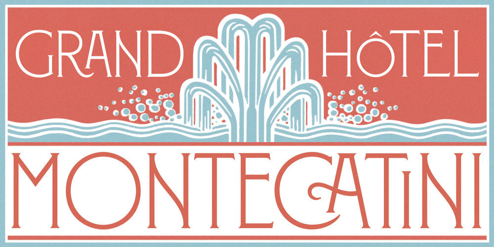
Montecatini by one of my favorite designers of all time: Louise Fili.
Montecatini takes its cues from the elegant Stile Liberty travel posters of Italy in the early 1900s. The font features distinctive ligatures typical of the time when Art Nouveau emerged as a worldwide phenomenon.
Image via http://www.louisefili.com

No, this is not a lettering piece. This is a font. Bibliophile Script by Ale Paul.
Bibliophile comes in 2 weights, each of them with over 900 glyphs covering all the latin languages.
Image via https://www.myfonts.com/fonts/sudtipos/bibliophile-script/

Carter Sans by Matthew Carter.
Image via https://www.myfonts.com/fonts/itc/carter-sans/
Different but very related
Once you learn a bit about each category, you can see how even though they are different and have very different principles, they are undoubtedly intertwined. For example: a lettering artist needs to understand the science behind using a tool for each stroke so they know why a letter should be drawn a certain way.
But how can lettering or calligraphy make you a better type designer? Lucky for you, Veronica Grow from Old School New School will give us that answer really soon!
Sources:
The Typographic Desk Reference.
In Progress by Jessica Hische