Serifs vs. Sans-Serifs
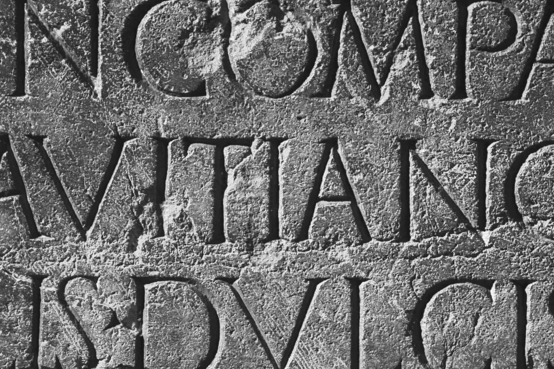
There are many ways to classify a typeface, and one of the most common classifications is by its style: serif or sans-serif (among others). Serif typefaces are called like that for obvious reasons, and in that classification you can find lots of sub-types: Old Style serifs, Transitional, Modern, etc. but let’s not rush into it. Sans Serif typefaces on the other hand lack serif details on characters.
Image via Ilnur Kalimullin – Unsplash.
And just in case you’re wondering, a serif is a slight projection finishing off a stroke of a letter in certain typefaces. In other words: The small lines attached to the main strokes of certain characters:
Serifs are the small lines on the ends of some of the strokes.
You can also find several styles or subtypes within this particular classification.
Serif typefaces can be categorised as: Old Style, Transitional, Modern or Slabs. Sans-serifs on the other, fit into these categories: Grotesque, Neo-Grotesque, Humanists and Geometrics.
Personally, I think the categories within the sans-serif classification are far more interesting and challenging. You would think it is impossible to include differentiating details in such simple letter forms, but you'll be amazed in how different they can be.

